| home Java Script MS Access Perl HTML Delphi C ++ Visual Basic Java CGIPerl MS Excel Front Page 98 Windows 98 Ms Word Builder PHP Assembler Link to us Links |

As you know by now, components are much of what gives Delphi its power. Using the Form Designer, you can place a component on a form and modify its design-time properties. In some cases, that's all you have to do. If needed, you can also manipulate the component at runtime by changing its properties and calling its methods. Further, each component is designed to respond to certain events. I discussed properties, methods, and events on Day 5, "The Visual Component Model," so I'm not going to go over that again.
Today you will find out more about components. You will learn about often-used components and, as a result, learn about the Visual Component Library (VCL) classes that represent those components. As you go through this chapter, feel free to experiment. If you read something that you want to test, by all means do so. Learning by experience is as valuable as anything you can do, so don't be afraid to experiment.
Let's review some of what you already know about components. Before doing that, though, I want to take a moment to explain the differences between a VCL component and a Windows control. Windows controls include components such as edit controls, list boxes, combo boxes, static controls (labels), and buttons, not to mention all the Win32 controls. Windows controls, by nature, don't have properties, methods, and events. Instead, messages are used to tell the control what to do or to get information from the control. To say that dealing with controls on this level is tedious and cumbersome would be an understatement.
A VCL component is a class that encapsulates a Windows control (not all VCL components encapsulate controls, though). A VCL component in effect adds properties, methods, and events to a Windows control to make working with the control easier. You might say that VCL takes a fresh approach to working with Windows controls. It could be said that all VCL components are controls, but not all controls are components. A VCL Edit component, for example, is a control, but a standard Windows edit control is not a VCL component. VCL components work with Windows controls to raise the job of dealing with those controls to a higher level.
Given that discussion, then, I will use the terms control and component interchangeably when referring to VCL components. (But I will never call a Windows control a component!)
Visual components include components such as edit controls, buttons, list boxes, labels, and so on. Most components you will use in a Delphi application are visual components. Visual components, as much as possible, show you at design time what the component will look like when the program runs.
New Term: Some components are visual components; others are nonvisual components. A visual component, as its name implies, is one that can be seen by the user at design time.
New Term: A nonvisual component is one that cannot be seen by the user at design time.
Nonvisual components work behind the scenes to perform specific programming tasks. Examples include system timers, database components, and image lists. Common dialog boxes such as File Open, File Save, Font, and so on are considered nonvisual components as well. (They are nonvisual because they don't show themselves at design time. At runtime, they become visible when they are invoked.) The common dialog components are discussed later in the section "The Common Dialog Boxes."
When you place a nonvisual component on a form, Delphi displays an icon representing the component on the form. This icon is used to access the component at design time in order to change the component's properties, but the icon does not show up when the program runs. Nonvisual components have properties, methods, and events just like visual components do.
Now let's look at some of the common properties components share.
The Name property serves a vital role in components. On Day 5, "The Visual Component Model," in the section "VCL Explored," I discussed some of what happens when you place a component on a form. As soon as you place a component on a form, Delphi goes to work in the background while you ponder your next move. One thing Delphi does is create a pointer to the component and assign the Name property as the variable name. For example, let's say you place an Edit component on a form and change the Name property to MyEdit. At that point, Delphi places the following in the class declaration for the form (in the published section):
MyEdit: TEdit;
When the application runs, Delphi creates an instance of the TEdit class and assigns it to MyEdit. You can use this pointer to access the component at runtime. To set the text for the edit control, you would use
MyEdit.Text := `Jenna Lynn';
Delphi also uses the Name property when creating event-handler names. Let's say that you want to respond to the OnChange event for an Edit component. Normally, you double-click the Value column in the Object Inspector next to the OnChange event to have Delphi generate an event handler for the event. Delphi creates a default function name based on the Name property of the component and the event being handled. In this case, Delphi would generate a function called MyEditChange.
You can change the Name property at any time provided that you change it only via the Object Inspector. When you change a component's Name property at design time, Delphi goes through all the code that it previously generated and changes the name of the pointer and all event-handling functions.
NOTE: Delphi will change all the code that it generated to reflect the new value of the component's Name property, but it will not modify any code you wrote. In other words, Delphi will take care of modifying the code it wrote, but it is up to you to update and maintain the code you wrote. Generally speaking, you should set the Name property when you initially place the component on the form and leave it alone after that. There's no problem with changing the name at a later time, but it might lead to more work.
Continuing with this example, if you change the Name property of the edit control from MyEdit to FirstName, Delphi will change the pointer name to FirstName and the OnChange handler name to FirstNameChange. It's all done automatically; you don't have to do anything but change the Name property and trust that Delphi will do the rest of the work.
CAUTION: Never change the Name property at runtime. Never manually change a component's name (the name that Delphi assigned to the component's pointer) or event-handler names in the Code Editor. If you perform either of these actions, Delphi loses track of components and the results are not good, to say the least. You might even lose the ability to load your form. The only safe way to change the Name property of a component is through the Object Inspector.
Delphi assigns a default value to the Name property for all components placed on a form. If you place an Edit component, for example, Delphi assigns Edit1 to the Name property. If you place a second Edit component on the form, Delphi will assign Edit2 to that component's Name property, and so on. You should give your components meaningful names as soon as possible to avoid confusion and extra work later on.
NOTE: You can leave the default names for components that will never be referenced in code. For example, if you have several label components that contain static (unchanging) text, you can leave the default names because you won't be accessing the components at runtime.
All components have certain properties in common. For example, all visual components have Left and Top properties that determine where the component is placed on the form. Properties such as Left, Top, Height, and Width are self-explanatory, so I won't go over them here. A few of the common properties, however, warrant a closer look.
On Day 6, "Working with the Form Designer and the Menu Designer," I discussed the Align and Alignment properties, so I won't go over those again in detail. Refer to Day 6 for complete information on Align. It should be noted here, however, that not all components expose the Align property at design time. A single-line edit control, for example, should occupy a standard height, so the features of the Align property do not make sense for that type of component. As you gain experience with Delphi (and depending on the type of applications you write), you will probably rely heavily on the Align property.
The Color property sets the background color for the component. (The text color is set through the Font property.) Although the Color property is simple to use, there are a few aspects of component colors that should be addressed.
The way the Color property is handled in the Object Inspector is somewhat unique. If you click the Value column, you see the drop-down arrow button indicating that you can choose from a list of color values. That is certainly the case, but there's more to it than that. If you double-click the Value column, the Color dialog box will be displayed. This dialog box enables you to choose a color from one of the predefined colors or to create your own colors by clicking the Define Custom Colors button. Figure 7.1 shows the Color dialog box after the Define Custom Colors button has been clicked.
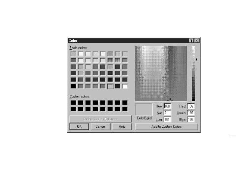 FIGURE 7.1.The
Color dialog box.
FIGURE 7.1.The
Color dialog box.
NOTE: This is the same Color dialog box that will be displayed if you implement the ColorDialog component in your application.
If you choose a color from the Color dialog box, you see that the value of the Color property changes to a hexadecimal string. This string represents the red, green, and blue (RGB) values that make up the color. If you know the exact RGB value of a color, you can type it in (not likely!).
Most of the time you will probably choose a color from the list of color values provided. When you click the drop-down button to display the list of possible values, you will see what essentially amounts to two groups of values. The first group of colors begins with clBlack and ends with clWhite. These are the Delphi predefined colors; this list represents the most commonly used colors. To choose one of the listed colors, simply click the color in the list. If you can't find a color in the list that suits your needs, you can invoke the Color dialog box as discussed.
The second group of colors in the list begins with clScrollBar. This group of colors represents the Windows system colors. If you use colors from this list, your application will automatically adjust its colors when the user changes color schemes in Windows. If you want your application to follow the color scheme the user has chosen for his or her system, you should choose colors from this list rather than from the first list.
Use of color should be carefully considered. Proper use of color provides an aesthetically pleasing environment for the user. Abuse of colors makes for an obnoxious application that is annoying to use. Color is like a magnet to new programmers. It is common to want to throw lots of colors on a form because it's fun and easy, but don't get caught up in the fun at the expense of your users.
The Cursor property controls the cursor that is displayed when the user moves the mouse cursor over the component. Windows automatically changes cursors for some components. For example, Windows changes the cursor to an I-beam when the cursor is moved over an Edit, Memo, or RichEdit component.
To let Windows manage the cursor, leave the Cursor property set to crDefault. If you have specialized windows (components), you can specify one of the other cursors. When the mouse is moved over that component, Windows will change the cursor to the one you specified.
Frequently, you will need to change cursors at runtime. A long process, for example, should be indicated to the user by displaying the hourglass cursor. When you reset the cursor, you need to be sure to set the cursor back to whatever it was originally. The following code snippet illustrates this concept:
var
  OldCursor : TCursor;
begin
  OldCursor := Screen.Cursor;
  Screen.Cursor := crHourGlass;
  { do some stuff which takes a long time }
  Screen.Cursor := OldCursor;
end;
This ensures that the cursor that was originally set for the application is properly restored.
Another cursor property, DragCursor, is used to set the cursor that is used when the mouse cursor is over a component that supports drag-and-drop. As with colors, you should be prudent in your use of cursors. Use custom cursors when needed, but don't overdo it.
Components can be enabled or disabled through the Enabled property. When a component is disabled, it cannot accept focus (clicking on it has no effect), and usually it gives some visual cue to indicate that it is disabled. In the case of buttons, for example, the button text is grayed out as is any bitmap on the button. Enabled is a Boolean property: Set it to True to enable the component or set it to False to disable the component. Enabling and disabling windows (remember that windowed components are windows, too) is a feature of Windows itself.
NOTE: Some components show their disabled state at design time, but most don't. The BitBtn component is one that does show its disabled state at design time.
The Enabled property applies mostly to windowed components, but it can apply to non-windowed components as well. The SpeedButton component is an example of a non-windowed component that can be disabled.
NOTE: Modifying the Enabled property for a Panel component has additional implications. Panels are often used as containers for other controls. Therefore, a panel becomes the parent of the controls that are placed on the panel. If you disable a panel, the components on the panel will not show as disabled, but they will not function because their parent (the panel) is disabled.
Although components can be disabled at design time, enabling and disabling components is something that is usually done at runtime. Menu items, for example, should be enabled or disabled according to whether they apply at a given time. The same is true of buttons. There are a variety of reasons why you might want to disable other types of controls as well.
To disable a component at runtime, just assign False to its Enabled property, and to enable a component assign True to Enabled. The following code snippet enables or disables a menu item based on some condition:
if CanSave then
  FileSave.Enabled := True
else
  FileSave.Enabled := False;
This process is often referred to as command enabling and is an important part of a professional-looking Windows program.
TIP: The TActionList component can be used to enable or disable a component or groups of components. TActionList is discussed in detail on Day 13, "Beyond the Basics," in the section "Command Enabling."
The Font property is a major property and therefore needs to be included here, but there is not a lot that needs to be said about it. The Font property is an instance of the TFont class and, as such, has its own properties. You can set the Font properties by double-clicking on the font name in the Object Inspector (which will expand the Font node and show the Font properties) or by invoking the Font dialog box. (The Font dialog box is discussed in more detail later in this chapter in the section "The Font Dialog Box.") Figure 7.2 shows the Object Inspector with the Font property node expanded to reveal the TFont properties.
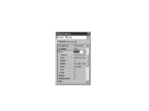 FIGURE 7.2.The
Object Inspector showing the Font property.
FIGURE 7.2.The
Object Inspector showing the Font property.
The Color property sets the color of the font, and the Name property enables you to choose the typeface for the font.
The Height and Size properties of TFont deserve special mention as well:
When you change one of these properties, the other will change automatically. The Height is often specified as a negative number. Refer to the online help for TFont for an explanation of why this is the case.
The Pitch property is not particularly useful. I'll explain it in just a moment, but first a quick tutorial on fonts. A font can be either proportionally spaced or fixed space:
In theory, the Pitch property can be used to force a proportionally spaced font to fixed space and vice versa. The problem is that Windows might perform font substitutions to carry out the conversion. In other words, you really don't know what you might get. It is far better to pick exactly the font you require than to rely on the Pitch property.
Finally, the Style property of TFont can be used to toggle bold, italic, underline, or strikethrough. These styles are not mutually exclusive, so you can mix styles in any way you choose.
TIP: Although you can use the Object Inspector to change font properties, the Font dialog box (invoked when you click the ellipsis button next to the Font property) has the added benefit of showing you a sample of what the font looks like as you choose different font options. To simply change the font's Style property or Size property, use the Object Inspector. But if you are looking for just the right font, the Font dialog box is a better choice.
The Hint property is used to set hint text for a component. The hint text has two parts. The first part is sometimes called the short hint. This is the hint text that is displayed when the user places the cursor over the component and pauses. The pop-up window that displays the hint text is called a tooltip.
The second part of the hint text is sometimes called the long hint. The long hint is the optional hint text that shows in the status bar when the user moves the mouse cursor over the component. The short and long hint texts are separated by a pipe (|). For example, to specify both the short hint text and the long hint text for a File Open speed button, you would enter the following for the Hint property:
File Open|Open a file for editing
In order for short hints to show, you must have the Application object's ShowHint property set to True (the default) as well as the component's ShowHint property. Displaying the long hint in the status bar requires a little more work, so I'll save that discussion for tomorrow.
NOTE: You can specify the short hint text, the long hint text, or both. You can use the pipe to tell Delphi which hint text you are supplying. If you don't use the pipe, both the short hint and the long hint will use the same text.
NOTE: Although there are no limits on the length of either the long hint or the short hint, you should keep each hint's use in mind when you create them. Short hints should probably be limited to 30 characters or fewer. Long hints can be more descriptive, but keep in mind that long hints that are very long will be truncated when displayed in the status bar.
The ParentColor, ParentCtl3D, ParentFont, and ParentShowHint properties work the same way, so I'll discuss them at the same time. When these properties are set to True, the component takes its Color, Ctl3D, Font, or ShowHint settings from its parent. For example, for most components the ParentFont property is set to True by default. This means the component will inherit the font that its parent is currently using. To better understand this, do this exercise:
You can set this property to False, but by the time the component is placed it is already too late and you will have to change the font manually to the font you want for the component.
The Tag property is nothing more than a four-byte variable set aside for your use. You can use the Tag property to store any data that your component might need. The data stored might be a pointer to another class, an index value, or any number of other possibilities. Using the Tag property would probably be considered an advanced programming technique.
Table 7.1 lists other common properties that are frequently used. These properties don't require as much explanation, so they are listed here for your reference. Not all components have each of the properties listed.
| Property | Description |
| BorderStyle | Can be bsSingle or bsNone. Use bsNone when you want the component to blend in with the background. |
| BoundsRect | The rectangle of the entire component (not limited to only the client area). |
| Caption | Sets the component's caption. Many components don't have captions, so for those components the Caption property is not exposed. |
| ClientHeight | Contains the height of the client area of the component. |
| ClientRect | Contains the rectangle for the client area of the component. |
| ClientWidth | Contains the width of the client area of the component. |
| Constraints | Sets the size constraints for the component (maximum width and height, minimum width and height). More important for forms than for other components. |
| Ctl3D | Indicates whether the control should be drawn with a 3D border. If BorderStyle is set to bsNone, this property has no effect. |
| Height | Sets the component's height. |
| HelpContext | The HelpContext property is used to associate an index number in a help file with a particular component. |
| Left | Sets the x-coordinate of the component. |
| Parent | A pointer to the parent of the component. |
| PopupMenu | Specifies the pop-up menu that will be displayed when the user clicks the secondary mouse button. |
| TabOrder | For windowed components. Sets this component's position in the tab order. |
| TabStop | For windowed components. Indicates that this component can be tabbed into. Setting this property to False removes the component from the tab order. |
| Top | Sets the y-coordinate of the component. |
| Visible | When read, indicates whether the component is currently visible. When written to, Visible either hides or shows the component. |
| Width | Sets the width of the component. |
There are more than 20 methods that most components have in common. Windowed components have more than 40 common methods from which to choose. Interestingly, not many of these are widely used. Much of the functionality of components is accomplished via properties. For example, to hide a component, you can call the Hide method or you can set the Visible property to False. In addition, components typically have methods specific to their purpose, and it will likely be those methods that you use most when dealing with a particular component.
There are a few methods worthy of note, however, so I'll list them here (see Table 7.2). Note that some of these methods are not available to all controls. These are not the most often used methods common to every component, but rather the most commonly used methods of components in general. Also, this list concentrates on components representing controls (components placed on forms) rather than components as forms. Methods particular to forms were discussed on Day 4, "The Delphi IDE Explored."
| Method | Description |
| Broadcast | Used to send a message to all windowed child components. |
| ClientToScreen | Converts client window coordinates into screen coordinates. |
| ContainsControl | Returns True if the specified component is a child of the component or form. |
| HandleAllocated | Returns True if the Handle property for the component has been created. Simply reading the Handle property automatically creates a handle if it hasn't already been created, so HandleAllocated can be used to check for the existence of the handle without creating it. |
| Hide | Hides the component. The component is still available to be shown again later. |
| Invalidate | Requests that the component be redrawn. The component will be redrawn at Windows's earliest convenience. |
| Perform | Sends a message directly to a component rather than going through the Windows messaging system. |
| Refresh | Requests that a component be redrawn immediately and erases the component prior to repainting. |
| Repaint | Requests that a component be redrawn immediately. The component's background is not erased prior to repainting. |
| SetBounds | Enables you to set the Top, Left, Width, and Height properties all at one time. This saves time having to set them individually. |
| SetFocus | Sets the focus to a component and makes it the active component. Applies only to windowed components. |
| Update | Forces an immediate repaint of the control. Typically, you should use Refresh or Repaint to repaint components. |
Now let's take look at some of the events to which a component is most likely to respond.
As with properties and methods, there are some events that will be responded to most often. Components cover a wide variety of possible Windows controls, so each component will have individual needs. Events specific to forms are not covered here because I covered that information on Day 4. The most commonly used events are listed in Table 7.3.
| Event | Description |
| OnChange | This event is triggered when a control changes in one way or another. Exact implementation depends on the component. |
| OnClick | Sent when the component is clicked with either mouse button. |
| OnDblClick | This event occurs when the user double-clicks the component. |
| OnEnter | This event occurs when a windowed component receives focus (is activated). |
| OnExit | This event occurs when a windowed component loses focus as the result of the user switching to a different control. It does not occur, however, when the user switches forms or switches to another application. |
| OnKeyDown | This event is triggered when the user presses a key while the control has focus. Keys include all alphanumeric keys as well as keys such as the arrow keys, Home, End, Ctrl, and so on. |
| OnKeyPress | This event is also triggered when the user presses a key, but only when alphanumeric keys or the Tab, backspace, Enter, or Esc keys are pressed. |
| OnKeyUp | This event occurs whenever a key is released. |
| OnMouseDown | This event is triggered when the mouse button is pressed while it's over the component. The parameters passed to the event handler give you information on which mouse button was clicked, special keys that were pressed (Alt, Shift, Ctrl), and the x,y coordinate of the mouse pointer when the event occurred. |
| OnMouseMove | This event occurs any time the mouse is moved over the control. |
| OnMouseUp | This event is triggered when the mouse button is released while over a control. The mouse button must first have been clicked while on the control. |
| OnPaint | This event is sent any time a component needs repainting. You can respond to this event to do any custom painting a component requires. |
DEALING WITH MOUSE EVENTSMouse events have a couple of peculiarities that you should be aware of. If you are responding just to a mouse click on a component, you will want to keep it simple and only respond to the OnClick event. If you must use OnMouseDown and OnMouseUp, you should be aware that the OnClick event will be sent as well as the OnMouseDown and OnMouseUp events. For example, a single click will result in these events occurring (and in this order):
OnMouseDown
OnClick
OnMouseUp
Similarly, when the user double-clicks with the mouse, it can result in the application getting more events than you might think. When a component is double-clicked, the following events occur:
OnMouseDown
OnClick
OnDblClick
OnMouseUp
The point I am trying to make is that you need to take care when responding to both double-click and single-click events for a component. Be aware that you will get four events for a double-click event.
Multiple events will occur when a key is pressed, too. A keypress in an edit control, for example, will result in OnKeyDown, OnKeyPress, OnChange, and OnKeyUp events occurring.
The book's code (go to http://www.mcp.com/info and type 0-672-31286-7) contains a program called EventTst, which illustrates the fact that multiple events occur on mouse clicks and keypresses. Run this program and you will see how multiple events can be triggered based on certain user actions.
In just a moment you're going to look at some of the VCL components in more detail. First, however, I want to introduce you to a class that is used by certain VCL components--TStrings.
The TStrings class is a VCL class that manages lists of strings. Several VCL components use instances of TStrings to manage their data (usually text). For example, on Day 6 you used TStrings when you built the ScratchPad application. "I don't recall using a TStrings class," you say. Well, you did, but you just weren't aware of it. Remember when you saved and loaded files? You used something like this:
Memo.Lines.SaveToFile(SaveDialog.FileName);
The Lines property of TMemo is an instance of the TStrings class. The SaveToFile method of TStrings takes the strings and saves them to a file on disk. You can use the same technique to load a list box from a file on disk or save the contents of a list box to disk. In the case of the TListBox class, the property that holds the list box items is called Items. For example, try this exercise:
procedure TForm1.FormCreate(Sender: TObject);
var
  WinDir   : array [0..255] of Char;
  FileName : string;
begin
  GetWindowsDirectory(WinDir, SizeOf(WinDir));
  FileName := WinDir + `\win.ini';
  ListBox.Items.LoadFromFile(FileName);
end;
When the program runs, the list box will contain the contents of your WIN.INI file. Using this method, it's easy to load a list box from any ASCII text data file. The ComboBox component also has an Items property that works in exactly the same way.
You can add, delete, insert, and move items in a list box, combo box, or memo by calling the Add, Append, Delete, Insert, and Move methods of the TStrings class.
NOTE: How Add performs depends on the value of the Sorted property. If the Sorted property is set to True, Add will insert the string where it needs to be in the list of items. If Sorted is False, the new string will be added at the end of the list.
A component can be cleared of its contents by calling the Clear method. An individual string can be accessed by using the array subscript operator. For example, to retrieve the first string in a list of strings, you would use
Edit.Text := ListBox.Items[0];
NOTE: The strings in a TStrings class are actually contained in the Strings property. The Strings property is declared as the default array property for the TStrings class, so you don't specifically have to reference it when retrieving a specific string (although you can if you want to). Given that, then, the following two lines result in the same code being generated by the compiler:Edit.Text := ListBox.Items[0]; Edit.Text := ListBox.Items.Strings[0];
Each string in a TStrings array contains the string itself and four bytes of extra storage. This extra storage can be accessed through the Objects property, and you can use the extra storage any way you like. Let's say, for example, that you create an owner-drawn list box that displays bitmaps. You can store the string in the usual way and store a pointer to the TBitmap object in the Objects array.
TIP: There might be times when you need to manage a list of strings unrelated to a component. The TStringList class is provided for exactly that purpose. This class works just like TStrings but can be used outside of components. TStringList is particularly convenient for reading, manipulating, and storing text files.
NOTE: In reality, TStrings is what is called an abstract base class. An abstract base class is never used directly; it serves only as a base class from which to derive other classes. The Lines property is actually an instance of the TMemoStrings class rather than an instance of the TStrings class as I said in this section. This can be confusing because the Lines property is declared as a TStrings pointer but is actually an instance of TMemoStrings. The declaration and creation of the Lines property looks like this:var Lines : TStrings; { ...later } Lines := TMemoStrings.Create;
This is why the Lines property appears to be a TStrings but is really not. I didn't mean to lead you astray, but I thought it was best to make this distinction after the discussion on TStrings rather than confuse you with this information during that discussion.
New Term: An abstract base class is a class that cannot be used directly. A descendent class must be created using the abstract base class, and an instance of the descendent class is used instead.
Back in the Jurassic age, there was something called Windows 3.0. Windows 3.0 gave you options such as edit controls (single line and multiline), list boxes, combo boxes, buttons, check boxes, radio buttons, and static controls. These controls must have been fairly well designed because they are very prevalent in Windows programs today--even considering all the new Win32 controls.
I'm not going to go over every Windows control and its corresponding VCL component. There are a few points, though, that you should know regarding the standard components, which are covered in the next sections.
NOTE: I will refer to components in one of two ways: by the component's name or by the name of the VCL class that defines the component. I might say, "The Label component is used for..." or I might say, "TLabel is used for...." In either case, I am talking about the same component.
Delphi comes with four edit-control components. The Edit, Memo, and MaskEdit components are based on the standard Windows edit control. The RichEdit component is based on the Win32 rich edit control, which is not one of the standard Windows controls. Still, I will discuss RichEdit here because it has many features in common with the other edit controls.
The Edit component encapsulates the basic single-line edit control. This component has no Align or Alignment property. It has no Alignment property because the text in a single-line edit control can only be left-justified. The Edit component has no Align property because it cannot (or more accurately, should not) be expanded to fill the client area of a window.
TIP: If you need text in an edit component to be right-justified or centered, use a Memo component but make its height the height of a standard Edit component. Then set the Alignment property as needed.
NOTE: Keep your forms standard whenever possible. Although you can make an Edit component as tall as you like, it will confuse users if you make its height greater than a standard Windows edit control (it might appear to the user to be a multiline edit).
The MaskEdit component is an Edit component with an input filter, or mask, attached. The MaskEdit does not represent a Windows control per se, but rather is just a VCL extension of a standard edit control. A mask is used to force input to a specific range of numbers or characters. In addition, the mask can contain special characters that are placed in the edit control by default. For example, a date is commonly formatted as follows:
03/21/98
An edit mask for a date can already have the slashes in place so the user only has to enter the numbers. The edit mask would specify that only numbers can be entered to avoid the possibility of the user entering a nonnumeric character.
NOTE: The DateTimePicker component (found on the Win32 tab) enables you to pick a date or a time from a specialized edit component. When the Kind property is set to dtkDate, the component displays a drop-down calendar from which the user can choose a date. When Kind is set to dtkTime, the DateTimePicker displays a multi-field edit control that enables the user to set the hours, minutes, seconds, and AM or PM. The DateTimePicker is preferred over the MaskEdit for date and time entry.
The EditMask property controls the mask that is used. When you click the ellipsis button in the Value column for the EditMask property, the Input Mask Editor is displayed. This dialog box enables you to choose from one of the predefined masks or to create your own. You can choose prebuilt masks from several countries. Figure 7.3 shows the Input Mask Editor displaying the United States' set of predefined input masks.
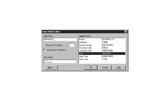 FIGURE 7.3. The
Input Mask Editor.
FIGURE 7.3. The
Input Mask Editor.
For more information on building your own masks, see the Delphi online help.
The Memo component encapsulates a multiline edit control. The Lines property is the most significant property in a Memo component. As I mentioned earlier in the discussion on TStrings, the Lines property enables you to save the contents of the Memo component to disk, load the Memo with text from a file, or access the memo's lines individually.
The ScrollBars property is unique to the Memo component. This property enables you to specify whether your component has a horizontal scrollbar, a vertical scrollbar, or both. You used the ScrollBars property on Day 6 when you wrote the ScratchPad application. The Memo component is a very versatile component that you will probably find yourself using frequently.
The RichEdit component is the biggest and the best of all the edit components; it is based on the Win32-rich edit control. The RichEdit component enables you to change fonts, use indentation, set text to bold, italic, or underlined, and much more. Basically, the RichEdit component is a mini word processor in one neat package. RichEdit has surprisingly few design-time properties over what the Memo component has.
Key runtime properties include SelAttributes and Paragraph. The RichEdit component is complex but easy to use, considering its complexities. See the Delphi online help for full details on the RichEdit component.
Table 7.4 lists the properties specific to components based on edit controls.
| Item | Applies To | Description |
|
Properties |
||
| AutoSelect | Edit, MaskEdit | When set to True, text in the edit control will automatically be selected when the user tabs to the control. Default: True |
| AutoSize | Edit, MaskEdit | When set to True, the edit control will automatically resize itself when the font of the edit control changes. Otherwise, the edit control does not change size when the font changes. Default: True |
| CharCase | Edit, MaskEdit | Determines whether the edit control displays uppercase (ecUpperCase), lowercase (ecLowerCase), or mixed text (ecNormal). Default: ecNormal. |
| HideScrollBars | RichEdit | When set to True, the scrollbars will be shown when needed but hidden otherwise. When set to False, the scrollbars are shown as determined by the value of the ScrollBars property. |
| HideSelection | Edit, Memo, RichEdit | When set to True, any text selected will not show as selected when the user tabs to another control. Default: False |
| Lines | Memo, RichEdit | The text contained in the component. Lines is an instance of the TStrings class. |
| MaxLength | All | Specifies the maximum number of characters that the component will hold. When set to 0, the amount of text that can be input is unlimited (limited only by system considerations). When set to any non-zero value, limits the number of characters to that value. Default: 0 |
| OEMConvert | Edit, Memo | Set this property to True when the text input will consist of filenames. Default: False |
| PasswordChar | Edit, MaskEdit | When this property is set to a value other than ASCII #0, any text entered will be echoed with the character provided. The actual text in the edit control is unaffected. Most password edits use the asterisk (*) as the password character. Default: #0 |
| PlainText | RichEdit | When set to True, RTF (rich text format) files will be shown as plain text without character and paragraph formatting. When set to False, RTF files are displayed with full formatting. Default: False |
| ReadOnly | All | When set to True, the component will display its text, but new text cannot be entered. The user can, however, highlight text and copy it to the Clipboard. Default: False |
| ScrollBars | Memo, RichEdit | Determines which scrollbars to display. Choices are ssNone, ssBoth, ssHorizontal, and ssVertical. Default: ssNone |
| Text | Edit, MaskEdit | Contains the text in the component. |
| WantReturns | Memo, RichEdit | When set to True, the component keeps the return character and a new line is inserted in the edit control when the user presses Enter. When set to False, return characters go to the form and are not placed in the edit control. If you have a form with a default button and WantReturns set to False, pressing Enter will cause the form to close. Default: True |
| WantTabs | Memo, RichEdit | When set to True, a tab character is placed in the edit control when the user presses the Tab key. When set to False, tab characters go to the form, which would enable tabbing out of the edit control. Default: False |
| WordWrap | Memo, RichEdit | When set to True, text entered will wrap to a new line when the right edge of the edit control is reached. When set to False, the edit control automatically scrolls as new text is entered. Default: True |
| Modified | All | Indicates whether the contents of the edit control have changed since the last time the Modified property was set. After saving the contents of a Memo or RichEdit component to a file, you should set Modified to False. |
| SelLength | All | Contains the length of the text currently selected in the edit control. |
| SelStart | All | Contains the starting point of the selected text in the edit control. The first character in the edit control is 0. |
| SelText | All | Contains the currently selected text in an edit control. |
Edit controls have many common methods; they are too numerous to list here. The CutToClipboard, CopyToClipboard, PasteFromClipboard, and Clear methods deal with Clipboard operations and text manipulation. The GetSelTextBuff and GetTextBuff methods retrieve the selected text in the component and the entire text in the component, respectively. See the Delphi online help topics TEdit, TMaskEdit, TMemo, and TRichEdit for a complete list of methods associated with each edit component.
The edit component events that you are most likely to be interested in are dependent on the type of edit control you are using. In general, though, the OnEnter, OnExit, OnChange, OnKeyDown (or OnKeyPress), and OnKeyUp events will be the most widely used.
The ListBox and ComboBox components are also widely used. The ListBox component represents a standard Windows list box, which simply presents a list of choices that the user can choose from. If the list box contains more items than can be shown at one time, scrollbars provide access to the rest of the items in the list box.
New Term: Some list boxes are owner-drawn list boxes. In an owner-drawn list box, the programmer takes the responsibility for drawing the items in the list box.
You can do owner-drawn list boxes if needed. Owner-drawn list boxes are fairly common, although you might not realize it. On Day 4 I talked about customizing the Delphi toolbar. As part of that discussion, you looked at the Delphi Toolbar Editor dialog box. The Toolbar Editor dialog box contains two list boxes (see Figure 7.4).
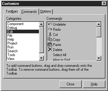 FIGURE 7.4. The
Toolbar Editor's Commands list box is owner-drawn.
FIGURE 7.4. The
Toolbar Editor's Commands list box is owner-drawn.
The list box on the left is a regular list box; it lists the possible button groups you can choose from. The list box on the right is an owner-drawn list box. It shows the actual button as it will appear on the toolbar, as well as a textual description of what function the button performs.
Combo boxes are specialized list boxes. Actually, a combo box is a combination of a list box and an edit control. The user can choose from the list or type in a value in the edit portion. When the user chooses an item from the list, that item is placed in the edit control. There are three different types of combo box. The combo box type is determined by the Style property. Table 7.5 lists the types of combo boxes and a description of each.
| Item | Description |
| Simple | The simple style of the combo box is nothing more than an edit control placed on top of a list box. The user can choose from the list or type text in the edit portion. |
| Drop-down | Similar to the simple style, except the list box portion is not initially displayed. A drop-down button is provided so that the user can view the list and choose an item. The user can also type text in the edit portion. |
| Drop-down list | This is the most restrictive type of combo box. As with the drop-down style, the list is not initially exposed. The user can click the drop-down button to expose the list and choose an item from the list, but cannot enter text in the edit portion. Use this style when you want the user to select only from a predetermined set of choices. |
The book's code contains a program called ComboTst that illustrates the different types of combo boxes. Figure 7.5 shows the test program running. Run the program and try out the combo boxes to get a feel for how each works.
 FIGURE 7.5. The
ComboTst program.
FIGURE 7.5. The
ComboTst program.
Table 7.6 lists the properties common to list boxes and combo boxes.
| Property | Applies To | Description |
| Properties | ||
| Columns | ListBox | Contains the number of columns in the list box. You can create multiple columns by making this property greater than 1. Default: 0 |
| ExtendedSelection | ListBox | Determines whether extended selection is allowed. Extended selection enables the user to select items using Shift+click and Ctrl+click. Has no effect if MultiSelect is set to False. Default: True |
| IntegralHeight | ListBox | When True, the list box height will be resized to be sure that no partial lines are displayed. When False, the list box might show partial lines. Default: False |
| ItemHeight | Both | For use with owner-drawn list boxes and combo boxes. Sets the height of the items in the control. Default: 13 |
| Items | Both | A TStrings instance that contains the list of items in the list box. (See the section on TStrings earlier in this chapter for a description of available properties and methods.) |
| MaxLength | ComboBox | The maximum number of characters the user can type in the edit portion of the combo box. Same as MaxLength in edit controls. Default: 0 (no limit) |
| MultiSelect | ListBox | When True, the list box enables multiple items to be selected. Default: False |
| Sorted | Both | When set to True, the list box items are sorted in ascending order. When set to False, the items are not sorted. Default: False |
| Style | ComboBox | The style of the combo box. Choices are csSimple, csDropDown, csDropDownList, lbOwnderDrawFixed, and csOwnerDrawVariable. (See Table 7.5 for a description of the three basic styles.) Default: csDropDown |
| ListBox | Style choices for list boxes are lbStandard, lbOwnderDrawFixed, and csOwnerDrawVariable. Default: lbStandard | |
| TabWidth | ListBox | List boxes can use tabs. This property sets the tab width in pixels. Default: 0 |