| home Java Script MS Access Perl HTML Delphi C ++ Visual Basic Java CGIPerl MS Excel Front Page 98 Windows 98 Ms Word Builder PHP Assembler Link to us Links |

Today you learn ways to turn a good Windows application into a great Windows application. Specifically, I discuss the following:
This discussion continues tomorrow as you look at implementing advanced Windows programming features in your Delphi applications.
No, I'm not talking about pretty lights around the front window of your house. What I am talking about are features such as toolbars and status bars. These features are often called window decorations. This section deals with these types of decorations and how to implement them in your application.
A toolbar (also called a control bar or a speedbar) is almost standard equipment for Windows programs today. Users expect certain amenities, and a toolbar is one of them. A top quality toolbar should have the following features and capabilities:
Some of the features in this list are optional features that not every toolbar needs to have. With Delphi, implementing these toolbar features is easy to accomplish. A little later in the chapter I talk about command enabling in the section "Adding Functionality with Command Enabling." I'll save discussion of command enabling for toolbar buttons for that time.
NOTE: It is considered good practice to place on the toolbar only buttons that have corresponding menu items. The toolbar is an alternative to using the menu. It should not contain items found nowhere else in the program.
On Day 8, "Creating Applications in Delphi," I said that the easiest way to construct a toolbar is to use the Application Wizard. Even if you already have a partially written application, you can still use the Application Wizard to create a toolbar. Just generate an application with the Application Wizard, copy the panel with the toolbar to the Clipboard, reopen your original application (don't bother saving the Application Wizard application), and paste the toolbar into your application from the Clipboard. Slick and easy.
However, the Application Wizard doesn't give you everything you could possibly need in a toolbar. Most notably, the Application Wizard uses the old method of creating a toolbar--with a panel and speed buttons. The preferred way of creating a toolbar is to use the ToolBar and CoolBar components (found on the Win32 tab of the Component palette). Let's take a look at those components next.
NOTE: The CoolBar and ToolBar components require version 4.72.2106.4 or later of COMCTL32.DLL, which should have been installed as part of the Delphi installation. If you don't have the latest version of this DLL, you can find it at Microsoft's Web site (http://www.microsoft.com). When you deploy your applications using these components, you should install COMCTL32.DLL version 4.70 or later. Be sure you are using a good installation program so that you don't overwrite a new version of this DLL when you install your application.
The CoolBar component is an encapsulation of the Win32 cool bar (sometimes called a rebar). This component is a specialized container control. Most of the time the CoolBar is used as a container for toolbars, but its use isn't limited strictly to toolbars.
A cool bar has bands that can be moved and resized at runtime. The bands show a sizing grip on the left side, giving the user a visual cue that the band can be moved or sized. Cool bar bands are represented by the TCoolBand class. A cool bar band can contain only one component. Usually that component is a toolbar, but it can be a combo box or any other component. Let's do an exercise to better understand how the CoolBar component works:
Now your form looks like Figure 13.1.
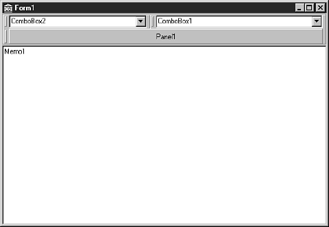 FIGURE 13.1. The
form with a cool bar and three bands.
FIGURE 13.1. The
form with a cool bar and three bands.
Now run the program. Experiment with the cool bar bands. Drag them up or down or resize them. Notice that as you drag the bands up or down, the cool bar resizes as needed and the memo always fills the remaining client area.
Cool bar bands are accessed through the Bands property. This property is a TCoolBands, which is a list of TCoolBand components. If you want to hide the second band, you can do this:
CoolBar.Bands[1].Visible := False;
You can add bands in two ways. As you have already seen, you can create a band by dropping any component on the cool bar, but you can also use the Bands Editor. To invoke the Bands Editor, double-click the cool bar or click the ellipsis button next to the Bands property in the Object Inspector. You add bands by clicking the Add button; you delete bands by clicking the Delete button. The Move Up and Move Down buttons enable you to change the order of the bands.
NOTE: If the AutoSize property is set to True, you will have to turn it off temporarily if you want to add new bands by dropping components on the cool bar. Set the AutoSize property to False, make the cool bar higher, drop a component on the cool bar, and set the AutoSize property to True again.
NOTE: When you select a band in the Bands Editor, the Object Inspector displays the band's properties. Figure 13.2 shows the Bands Editor and the Object Inspector when a band is selected.
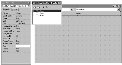 FIGURE 13.2. The
cool bar Bands Editor.
FIGURE 13.2. The
cool bar Bands Editor.
The Bitmap property enables you to set a background bitmap for a band. To select an image that will appear to the left of the band, you use ImageIndex. ImageIndex requires the ImageList property of the cool bar to be set to a valid TImageList. You can set a band's minimum height and width through the MinHeight and MinWidth properties. To make a band immovable, set the FixedSize property to True.
A cool bar can be either vertical or horizontal. By default the Align property is set to alTop. To make a vertical cool bar, change the Align property to alRight or alLeft. Some components, when placed on a cool bar, automatically orient themselves based on whether the cool bar is vertical or horizontal. Another way to change the orientation of the cool bar is by setting the Vertical property.
The Bitmap property enables you to set a background bitmap for the cool bar. The bitmap you choose will be tiled to fill the cool bar's background. Note that this sets the background bitmap for the cool bar itself, not for any individual bands on the cool bar (as discussed in the previous section). You use the ImageList property to set the image list that the bands will use to display an image to the left of any band that has its ImageIndex property set.
The AutoSize property determines whether the cool bar will resize itself when bands are moved. You saw the effect of the AutoSize property in the preceding exercise.
NOTE: Check out the TControlBar component on the Additional tab of the Component palette. TControlBar is a native VCL component that works very much like a cool bar. This component does not rely on COMCTL32.DLL as does TCoolBar, so it is less susceptible to the whims of Microsoft.
The ToolBar component encapsulates the Win32 toolbar control. The toolbar will automatically arrange and size the controls placed on the toolbar so that they all have a consistent height. You can use the ToolBar component with or without a cool bar. If you have only a single toolbar, use the toolbar without a cool bar. If you have multiple toolbars that you want to enable the user to move, place two or more toolbars on a cool bar.
Creating a toolbar and adding buttons to it is very easy. If your toolbar buttons will have glyphs (and most do), you have to use an ImageList component for the glyphs. To illustrate how to build a toolbar with the ToolBar component, let's again go back to the ScratchPad program. You'll tear it apart and put it back together.
If you recall, the toolbar you created for ScratchPad originally was just a placeholder. The first thing you need to do is get rid of the old toolbar by performing these steps:
Now you can start adding components back again. The first thing to do is add a cool bar and a toolbar. You don't really need a cool bar at this stage because you have only one toolbar, but you might want to add another toolbar later, so it's best to plan ahead. Perform these steps:
Now you begin adding buttons to the toolbar; you will add several buttons and a few spacers. At first the buttons won't have glyphs on them, but you'll take care of that later. For now, follow these steps:
TIP: Buttons and spacers added to the toolbar always appear to the right of the toolbar's last control. You can't insert a button at a specific location in the toolbar, but after a button or spacer is added, you can drag it to a different location on the toolbar. The existing buttons will make room for the new button.
That finishes the first set of buttons (except for the glyphs). You are about to add a second set of buttons, but before you do, there needs to be a little separation between the first set of buttons and the second. Back to work:
Your form now looks like the one shown in Figure 13.3.
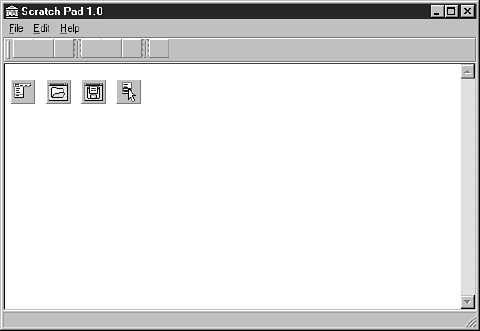 Figure 13.3. The
ScratchPad main form after adding a toolbar.
Figure 13.3. The
ScratchPad main form after adding a toolbar.
You now have a good start on the toolbar, but the toolbar buttons don't do anything because you haven't assigned any event handlers to their OnClick events. Let's do that next.
Obviously this toolbar is missing something. You need to add glyphs to the toolbar buttons. To do so, you must add an ImageList component to the form by following these steps:
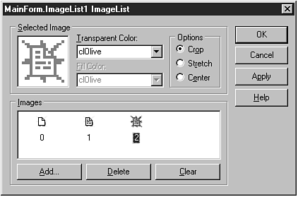 FIGURE 13.4. The
ImageList Editor after adding three images.
FIGURE 13.4. The
ImageList Editor after adding three images.
TIP: You can select multiple images in the ImageList Editor's Add Images dialog box and add them all to the image list at one time.
Now you are ready to hook the image list to the toolbar. Click on the toolbar. Locate the Images property in the Object Inspector and choose ImageList from the drop-down list. If you did everything right, your buttons now have glyphs. You probably didn't notice, but each time you added a toolbar button, Delphi automatically incremented the ImageIndex property for the button. Because you created the buttons and images in the same order, the glyphs on the buttons should be correct. If a button is wrong, you can either change the button's ImageIndex property or go back to the ImageList Editor and change the order of the images in the image list.
TIP: To rearrange the images in an image list, drag them to a new position in the ImageList Editor.
Right now you have glyphs only for the buttons in the enabled state. You also need glyphs that will be displayed when the buttons are disabled. You aren't disabling the toolbar buttons yet, but you will be before the day is done. There are two ways to implement the disabled button glyphs:
Certainly the easier of these two methods is to let the toolbar create the disabled state buttons automatically. Most of the time this is sufficient. Sometimes, however, the algorithm for creating the disabled buttons glyphs doesn't work well. (The glyphs end up losing definition and don't look quite right.) This happens with buttons that don't have enough contrasting colors. In that case, you can create a second image list that contains the disabled button glyphs. Set the DisabledImages property of the toolbar to the image list containing the disabled glyphs, and the rest is automatic. For ScratchPad you're going to go with the automatic disabling of toolbar buttons, so nothing further is required.
Poor old ScratchPad is back together again. This is a good time to save the project. After saving the project, click the Run button and give the program a workout. Click the buttons and see whether they do what they are supposed to do. If all went well, you have a working program again. If your program won't compile, review the steps and try to fix the problem. If all else fails, you can refer to the ScratchPad project of the book's code, available at http://www.mcp.com/info (Day 13).
I covered nearly everything there is to be said about tooltips and hints in the discussion of components on Day 7, "VCL Components"; again on Day 8, "Creating Applications in Delphi," when adding hint text support for the ScratchPad program; and again today when rebuilding the toolbar.
There is one issue I didn't talk about, and that is changing the tooltip properties. The TApplication class has four properties that control how the tooltips behave. Table 13.1 lists these properties and their descriptions.
| Property | Description |
| Hintcolor | Sets the background color of the Tooltip window. Default: CLINFOBK |
| HintHidePause | Controls how long to wait (in milliseconds) before hiding the tooltip if the mouse cursor remains stationary over the component. Default: 2500 milliseconds |
| HintPause | Controls the interval between the time the mouse cursor is paused over a component and the time the tooltip appears (in milliseconds). Default: 500 milliseconds |
| HintShortPause | Controls how long to wait before showing tooltips after they have already been shown--for example, when the user is roaming over a group of toolbar buttons. Default: 50 milliseconds |
The default values for these properties are sufficient for most applications. Still, if you need to change any hint properties, you have that option.
HOUSE RULES: TOOLBARS AND HINTS
- Don't use tooltips on controls where they will be in the way when the user wants to read the text in the control. In particular, don't use tooltips for edit controls and combo boxes. At a minimum, give the user the option to turn off tooltips for those types of controls.
- Keep your tooltip hint (the short hint) brief and to the point.
- Make your status bar hint (the long hint) more descriptive and meaningful.
- Consider giving your users the option of turning off hints altogether.
Because the ToolBar component is so versatile, nothing special needs to be done to add other types of controls to your toolbar. The most common type of control to add to a toolbar is a combo box. You can use a toolbar combo box to select a font, a configuration option, a zoom setting. . . the possibilities are endless.
To add a component to the toolbar, select the component from the Component palette and drop it on the toolbar. The toolbar will take care of aligning the component. Add spacers as necessary to separate components visually. When the component is on the toolbar, you deal with it just as you would a component on a form. I could try to complicate this for you, but the truth is, it's just that simple. If you've never tried to implement a combo box on a toolbar using the Windows API, you cannot appreciate how much work Delphi saves you. Take my word for it--it's significant.
Toolbars come in many shapes and sizes, and Delphi makes creating and implementing toolbars very easy. With Delphi, you no longer have the excuse, "That's too hard!" In fact, you might even enjoy creating toolbars with Delphi.
Dockable toolbars are common in many Windows programs. Dockable toolbars are a paradox of sorts. On the one hand, they are a cool feature and most power users expect a good application to have dockable toolbars. On the other hand, I doubt anyone actually uses the docking capability of most dockable toolbars. Still, dockable toolbars are easy enough to implement in Delphi, so you might as well provide them.
NOTE: The docking features discussed in this section apply to any windowed control, not just to toolbars.
Making a toolbar dockable requires two steps:
After you set these two properties, you can drag your toolbar around the screen. Dragging the toolbar around the screen doesn't get you very much, though. In order for dockable toolbars to make sense, you have to have a target for the drop part of the drag-and-drop equation.
A dockable toolbar needs to have a place to dock. As Roger Waters said, "Any fool knows a dog needs a home." Home for a dockable toolbar is a dock site. A dock site is any windowed component that has its DockSite property set to True. Components that are typically used as dock sites are TCoolBar, TControlBar, TPageScroller, TPanel, and TPageControl. There are other controls that have a DockSite property, but those controls are less likely to be used as dock sites.
An exercise helps illustrate the use of dock sites. Follow these steps:
Now run the program. Drag the toolbar from dock site to dock site. Notice how the toolbar changes its orientation when you drag it to the cool bar on the left side of the form.
Let's experiment some more. Set each of the CoolBar components' AutoSize properties to True. This will cause each CoolBar to change its size based on the controls it contains. Now run the program again and move the toolbar to the individual dock sites. Notice that each cool bar is nearly invisible until the toolbar is docked to the site. Then the cool bar expands to contain the toolbar.
A toolbar can be made into a floating toolbox by simply dragging the toolbar off its dock site and dropping it anywhere (anywhere other than another dock site, that is). The toolbar becomes a floating window. You can specify the type of window that should host the floating dock site by setting the FloatingDockSiteClass property to the name of the class you want to act as the parent to the floating toolbar. For example, suppose that you design a form that has all the characteristics you want for a custom floating toolbox, and that the form is called MyToolBox. In that case, you could cause this form to be the host for a floating toolbar with this code:
ToolBar.FloatingDockSiteClass := TMyToolBox;
When the toolbar is undocked and the mouse button released, Delphi will automatically create an instance of the TMyToolBox class and place the toolbar in the form for that class. To dock the floating toolbox again, simply drop it on any dock site. To make a dock site accept a floating toolbox, you must respond to the OnDockOver and OnDockDrop events for the dock site. In the OnDockDrop event handler, call the ManualDock method of the toolbar to cause the toolbar to dock.
A status bar is another feature that makes an application more marketable. Not all applications benefit from a status bar, but many can. The VCL StatusBar component, which encapsulates the Win32 status bar control, makes creating status bars a breeze. First, take a quick look at the major properties of the StatusBar component, listed in Table 13.2.
| Property | Description |
| AutoHint | Automatically displays hints in the status bar when the mouse cursor passes over any component whose Hint property has been set. |
| Panels | For status bars with multiple panels. This property defines the individual panels. |
| SimplePanel | Determines whether the status bar shows a simple panel or multiple panels. |
| SimpleText | The text for the status bar's simple panel. |
| Property | Description |
| SizeGrip | Determines whether the status bar displays the sizing grip in the lower-right corner. The sizing grip provides an area that the user can drag to size the window. The absence of the sizing grip doesn't prevent the window from being sized, but the presence of the size grip makes sizing a window easier. |
| UseSystemFont | Always uses the current system font, overriding the settings of the Font property. This is particularly useful for users who use Plus pack themes. |
As you can see from this table, a status bar can be a simple status bar or have multiple panels. Let's discuss this choice next.
A status bar can be either a simple status bar or a complex status bar. A simple status bar has a single panel that occupies the entire status bar. If you want a simple status bar, set the SimplePanel property to True. The SimplePanel property acts as a toggle. You can switch between a simple and a complex status bar at runtime by setting SimplePanel to True or False, accordingly.
A complex status bar is one with multiple panels. If you elect to use a complex status bar, you can use the StatusBar Panels Editor to set up the panels you want to see on your status bar. To invoke the StatusBar Panels Editor, double-click on the Value column of the Panels property. To add a panel, click the Add New button on the StatusBar Panels Editor. To delete a panel, click the Delete Selected button. To edit a panel, select the panel and then make changes to the panel's properties in the Object Inspector. Figure 13.5 shows the StatusBar Panels Editor and Object Inspector when editing panels.
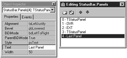 FIGURE 13.5. The
StatusBar Panels Editor.
FIGURE 13.5. The
StatusBar Panels Editor.
NOTE: The individual panels in a complex status bar are instances of the TStatusPanel class.
Most of the properties are self-explanatory, but a couple require further note. The Text property contains the text that will be displayed in the panel. You can also use the Text property at runtime to change the text in the panel. Setting the status bar text is discussed a little later; you don't need to supply text for the panel at design time if you are going to change the text at runtime.
You can set the Style property to either psText or psOwnerDraw. If the Style is set to psText (the default), the panel behaves as you would expect. The text is aligned in the panel according to the value of the Alignment property. If the Style is set to psOwnerDraw, it is up to you to draw any text or image that is displayed in the panel. Owner drawing of panel items is discussed later in the section "Owner-Drawn Status Bar Panels."
The Width, Bevel, and Alignment properties for the panel are straightforward. Experiment with these properties to see how they affect your status bar's appearance.
NOTE: In the Form Designer you immediately see the results of changes made to the status bar via the StatusBar Panels Editor. Position the StatusBar Panels Editor so that you can view the status bar as you work with the StatusBar Panels Editor. Each time you make a change, it will be reflected in the Form Designer.
When you are done adding panels to the status bar, close the StatusBar Panels Editor and return to the Form Designer.
NOTE: When you modify the Panels property of a StatusBar component, the Form Designer automatically sets the SimplePanel property to False. The assumption is that if you are using multiple panels, you don't want to have a simple status bar.
There are two ways to change text in a status bar:
Manually changing the text in the status bar is simple, particularly if you have a simple status bar. When the SimplePanel property is True, you can set the SimpleText property to the text you want displayed in the status bar:
StatusBar.SimpleText := `This shows up in the status bar.';
In the case of complex status bars, changing the text is only slightly more complicated. If you want to change the text for the first panel of a complex status bar, you would use something like this:
StatusBar.Panels[0].Text := `Status Bar Text';
The Panels property of the StatusBar component has a property called Items that is an array of panels in the status bar. Setting the Text property for an element in the Items array changes the text for that panel (because Items is the default array property for the Panels object, you don't have to specifically reference Items). As you can see, the array is 0-based. The first panel in the status bar is array element 0.
Automatic status bar hint text doesn't require much in the way of explanation. All you have to do is set the AutoHint property to True. The rest is, as the property name implies, automatic.
NOTE: You can still modify the status bar's text manually even when using AutoHint. There's nothing to stop you from changing the text manually, but remember that the text will be replaced the next time the mouse passes over a component with hint text.
Earlier I said that a panel's Style property can be either psText or psOwnerDraw. When you set a panel's style to psOwnerDraw, you must take the responsibility of drawing anything in the panel that needs to be displayed there. It is unlikely that you are going to go to the trouble of using an owner-drawn panel just to display text. Usually it means you are going to display some sort of icon or bitmap in the status bar. Regardless of what is being drawn on the panel, the steps are the same:
Obviously, the real work here is going to take place in the event handler for the OnDrawPanel event. The declaration for the OnDrawPanel event handler looks like this:
procedure TForm1.StatusBar1DrawPanel(StatusBar: TStatusBar;
  Panel: TStatusPanel; const Rect: TRect);
The StatusBar parameter is a pointer to the status bar. Usually you have a pointer to the status bar anyway (the Name property of the StatusBar component), so this parameter is not all that useful unless you are using multiple owner-drawn status bars. The Panel property is a pointer to the particular panel that currently needs drawing. You can use this parameter to determine which panel needs drawing if you have more than one owner-drawn panel in your status bar. The Rect parameter contains the panel's size and position. The Rect parameter is important because it tells you the exact dimensions of the drawing area.
The OnDrawPanel event handler is called once for each panel that has its Style property set to psOwnerDraw. If you have only one panel to draw, you don't have to worry about much except the Rect parameter. If you have multiple panels to draw, you must first determine which panel to draw and then do your drawing. An illustration might help to explain this. The book's code includes a program called StatBar that illustrates some of the things you can do with status bars. Run the program and examine its source for tips on implementing status bars in your applications. Figure 13.6 shows the StatBar program running.
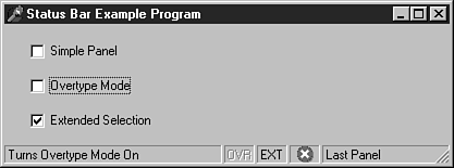 FIGURE 13.6. The
StatBar program with owner-drawn status bar panels.
FIGURE 13.6. The
StatBar program with owner-drawn status bar panels.
As you can see, the status bar in this program has multiple panels. The middle three panels are owner-drawn. The panels marked OVR and EXT simulate the status bar on a word processing program or code editor. In those types of programs, the Overtype or Extended Selection modes might be on or off. If the mode is on, the text in the status bar panel shows in black. If the mode is off, the text has a 3D disabled-text appearance. The third owner-drawn panel displays a stock Windows icon to illustrate the use of a graphic on a status bar. Run the program and experiment with it to learn how it works.
Listing 13.1 shows the OnDrawPanel event handler from the StatBar program. Examine it and read the comments to understand what is going on in the code.
procedure TMainForm.StatusBarDrawPanel(StatusBar: TStatusBar;
  Panel: TStatusPanel; const Rect: TRect);
var
  R : TRect;
  Icon : HIcon;
begin
  with StatusBar.Canvas do begin
    { Create a temporary TRect object. The Rect parameter
    { is const so we can't change it. }
    R := Rect;
    { Check to see if panel 3 is the panel which needs
    { to be drawn. If so, draw an icon in the panel. }
    if Panel.Index = 3 then begin
        { Load one of the stock Windows icons. This time
        { using the API is easier than using VCL. }
        Icon := LoadIcon(0, IDI_HAND);
        { Draw the icon and shrink it down to 15 x 15 pixels. }
        { Center it in the panel, too. }
        DrawIconEx(Handle, Rect.Left + 6, 3,
          Icon, 15, 15, 0, 0, DI_NORMAL);
        { Nothing more to do. }
        Exit;
    end;
    { This rather lengthy if statement checks to see if
    { either the Overtype Mode or Extended Selection
    { check boxes are checked. If so, then what we need
    { to do is to draw the text twice. First, we draw it
    { in white. Then we draw it again, offset by 1 pixel,
    { in gray. The effect is a 3D disabled-text look. }
    if ((Panel.Index = 1) and (OvrMode.Checked = False)) or
      ((Panel.Index = 2) and (ExtendedSel.Checked = False))
        then begin
      { Move over and down one pixel for the offset. }
      Inc(R.Left);
      Inc(R.Top, 2);
      { Change the text color to white. }
      Font.Color := clWhite;
      { Set the backround mode to transparent so the
      { text appears hollow and so that the white
      { text can be seen under the gray. }
      Brush.Style := bsClear;
      { Draw the text using the API function DrawText. }
      { I use DrawText because it allows me to center
      { the text both horizontally and vertically within
      { the given rectangle. }
      DrawText(Handle, PChar(Panel.Text), -1,
        R, DT_CENTER or DT_VCENTER or DT_SINGLELINE);
      { Set the color to gray because we're going to
      { draw the text in gray in a moment. }
      Font.Color := clGray;
{ Set the rect back to the original size. }
      Dec(R.Left);
      Dec(R.Top, 2);
    end;
    { Display the text. If the item is not disabled then
    { the default color (black) is used to draw the text. }
    { If the item is disabled, then the text color has
    { been set to gray by the code above. }
    DrawText(Handle, PChar(Panel.Text), -1,
      R, DT_CENTER or DT_VCENTER or DT_SINGLELINE);
  end;
end;
This code might seem intimidating, but most of it is comment lines. The code itself is relatively simple. The comment lines explain what is happening at each step: The 3D appearance for the disabled text is accomplished by drawing the text once in white and then drawing it again in gray with a slight offset. The result is that the text looks recessed. The icon is displayed using the Windows API functions LoadIcon and DrawIconEx.
Owner drawing of status bar panels is daunting at first, but you'll soon find out that it's not all that bad. You might write Windows applications for a long time and never need owner-drawn panels in your status bar. If you ever need them, however, you'll know that's not impossible to accomplish.
Command enabling is the process of enabling or disabling buttons depending on current conditions. For example, there's not much point of having the Cut or Copy button or menu item enabled for a text editor when no text is currently selected. Likewise, if there is no text in the Clipboard, the Paste button should be disabled.
Command enabling isn't difficult, especially with Delphi's new TActionList component. Still, it takes time to get right. It takes time because you have to pay attention to detail. (Sometimes it is attention to detail that separates the great applications from the mediocre applications.)
The TAction class provides a convenient way of performing command enabling. TActionList, the nonvisual component that manages actions, is found on the Additional tab of the Component palette. TActionList, as its name implies, contains a list of TAction objects. You create an action and then assign that action to any controls that need to be enabled or disabled based on that action. By controls I mean menu items, toolbar buttons, context menu items, and so on.
Let's take the Edit|Cut menu item, for example. You could have at least three objects associated with this particular task:
You create actions with the ActionList Editor. Given the Edit|Cut example, you would create an action for Cut called, say, CutAction. Then, using the Object Inspector, you assign CutAction to the Action property of each of the objects that correspond to the cut operation (toolbar buttons and menus, for example). At runtime, when you need to enable the Cut option, you can do so with just one line of code:
CutAction.Enabled := True;
This will enable all components with their Action properties set to CutAction. Disabling the Cut items is as simple as assigning False to the Enabled property of the action. The OnUpdate event of TAction and TActionList provides a convenient place to put your command-enabling code.
Command enabling with TAction is something that you have to experience to fully appreciate. You add command enabling to ScratchPad in the next section.