| home Java Script MS Access Perl HTML Delphi C ++ Visual Basic Java CGIPerl MS Excel Front Page 98 Windows 98 Ms Word Builder PHP Assembler Link to us Links |
Putting It All Together with Word 97
What you will learn from this lesson
With Word 97 you will:
What you should do before you start this lesson
Starting the lesson
Exploring the lesson
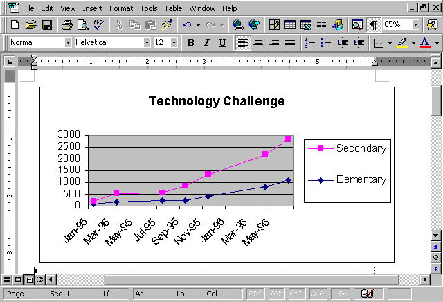
Throughout this book you have been building one skill upon another to create a report using Word 97. You can apply these skills to tasks in and out of the classroom. This chapter uses graphs that are created through Excel 97 from charts that are part of the report on the Technology Literacy Challenge from the U.S. Department of Education.
Charts turn data into information. In building charts you analyze information, quantify it, and present it visually. Charts make it easier to interpret and relate to data.
Creating a chart starts with a data table, which consists of the chart’s titles and the numbers that make it up.
Entering data into a data table
Dates Elementary Secondary
1/1/95 85 110
3/1/95 160 360
7/1/95 225 354
9/1/95 250 600
11/1/95 425 900
4/1/96 800 1400
6/1/96 1100 1720
It can be more efficient when you enter data to Press TAB to move across from cell to cell in the worksheet, and press Enter to move down from cell to cell.
Using the Chart wizard
The Chart wizard takes you step-by-step through the charting process.
Starting the Chart wizard
Your graph is now pasted in your Word document as shown in the example.
Changing the chart size
The chart you just created may not be the size you need. Just as with other charts, graphics or pictures in Word 97, changing the size of charts is fast and easy.
Changing the size of your chart
How you can use what you learned
Word 97 accepts typical spreadsheet data and, through Excel 97 wizards, easily and quickly creates charts. (If your computer is an older model, some of the wizards may run a little slowly.) Charts translate lists of numbers into understandable information. For example, you can enter, analyze, and paste student grades into Word documents without being an Excel 97 expert.
Extensions
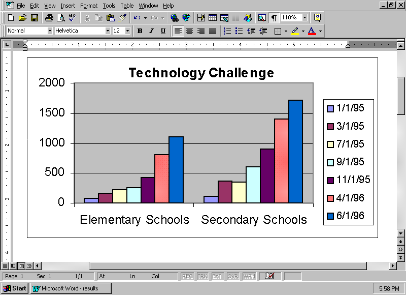
Sometimes data having no recognizable pattern in one chart type gains high impact when it is displayed in a different chart. If you change just a few of the chart’s characteristics, you gain a different perspective of the data, as shown in the following example. Play with the charts in Microsoft Excel 97 to see whether your information can be better displayed with other charts.
Summarizing what you have learned
Through this chapter you have explored and practiced: